CF: Snoozle.
This project, undertaken as part of the CareerFoundry curriculum, focused on designing Snoozle, a mobile app aimed at helping users improve their sleep quality.
Snoozle provides personalized guidance for establishing effective morning and evening routines. Whether users are new to sleep optimization or need to get back on track, Snoozle offers tailored routines and advice to help them regain a restful sleep cycle and improve their overall well-being.
Client:
CF – CareerFoundry
(Student Project)
Company:
–
Year:
2024
Tools:
Figma
Procreate
Lyssna
ChatGPT
Briefing.
The Snoozle app is part of a flexible project brief focused on creating a (mental) health or wellness application.
Scope.
-
Allow health-conscious individuals to log in to a health and wellbeing portal to record their health information, as well as access general mental wellbeing features.
-
An onboarding page (a screen or screens that show(s) the user the basics of getting started)
A way to sign up and log in that lets users input and save their personal information
A home screen or dashboard where users can access their information
A menu that allows users to navigate the application
A feature that allows users to store and log their medical and health information (e.g., appointments, medication, diagnoses, injuries, treatments, vaccinations, etc.)
An education and training feature that supports the users in learning more about health and wellness (consider resources, training, events, etc.)
Optional: A gamified component involving points, badges, or rewards for healthy behaviours.
-
Achievement 1: Thinking like a UXer
Problem statement
UX competitive analysis
List of business requirements
User stories for your app
Achievement 2: Understanding the user
User Interviews
User personas
Illustration of user flows
User journey map
Card sorting session
Sitemap
Achievement 3: Prototyping and UI fundamentals
Low-fidelity prototypes
Mid-fidelity prototypes
Interactive and clickable prototypes
Design System
Achievement 4: Usability testing
Test plan
Test scripts
Recommendation for future design efforts
A/B Testing
Achievement 5: Refining the design for handoff
Basic HTML document
Polished prototype Snoozle
-
Programming the app, final content and more advanced features.
-
3 months.
Excerpts of the progress.
This section highlights key milestones from the Snoozle app design journey, showcasing the progression from initial research to prototype development.
Understanding the problem.
In the early stages of designing Snoozle, I conducted research to identify common sleep-related issues users might face. This research helped shape the problem statement, which defined the key challenges preventing users from maintaining healthy sleep habits.
From there, I explored possible solutions that could be implemented in the app to address these challenges, ensuring the design would effectively meet user needs and promote better sleep routines.
Who’s in the ring?
To better understand the landscape of sleep and routine optimization apps, I conducted a competitive analysis of two key players: Calm and Routinery.
By analyzing their strengths and weaknesses, I gained valuable insights into how these apps address user needs, which helped shape the design direction for Snoozle. This comparison provided a clearer understanding of where Snoozle can stand out in delivering effective sleep routines.
Hearing it firsthand.
To better understand the target audience for Snoozle, I conducted three user interviews. With clear research goals and 15 guiding questions, these conversations provided valuable insights into users’ sleep habits and challenges.
The key findings from these interviews were instrumental in shaping the creation of detailed user personas, which helped inform the app’s design direction.
Connecting the dots & finding patterns.
After gathering insights from both my research and user interviews, I analyzed the findings to identify common patterns and key themes. Using affinity mapping, I organized and categorized the data to better understand users’ needs, challenges, and goals.
This analysis provided a clear direction for the next steps in the design process, ensuring the app addresses the most pressing user concerns.
You can click on the button below to access the FigJam board and explore the data findings and affinity map in detail.
It’s nice to meet you,
Louise & Felix!
Based on the insights gathered from research and user interviews, I created two key personas: Louise and Felix. These personas represent the typical users of Snoozle, each with unique sleep challenges and goals.
Louise and Felix help bring the data to life, guiding the design process by ensuring the app meets the real needs of users and delivers meaningful solutions for improving their sleep routines.
Louise & Felix’s journey to dreamland.
To better understand how users like Louise and Felix interact with Snoozle, I created a User Journey Map as well as User Flows.
The journey map illustrates the key touchpoints and emotional experiences as users work toward improving their sleep routines.
Meanwhile, the user flows break down the specific steps Louise & Felix take to navigate through the app, ensuring that the design facilitates a seamless and intuitive experience from start to finish.
You can click on the buttons below to access the FigJam boards and explore the journey map and flows in detail.
Sorting it out.
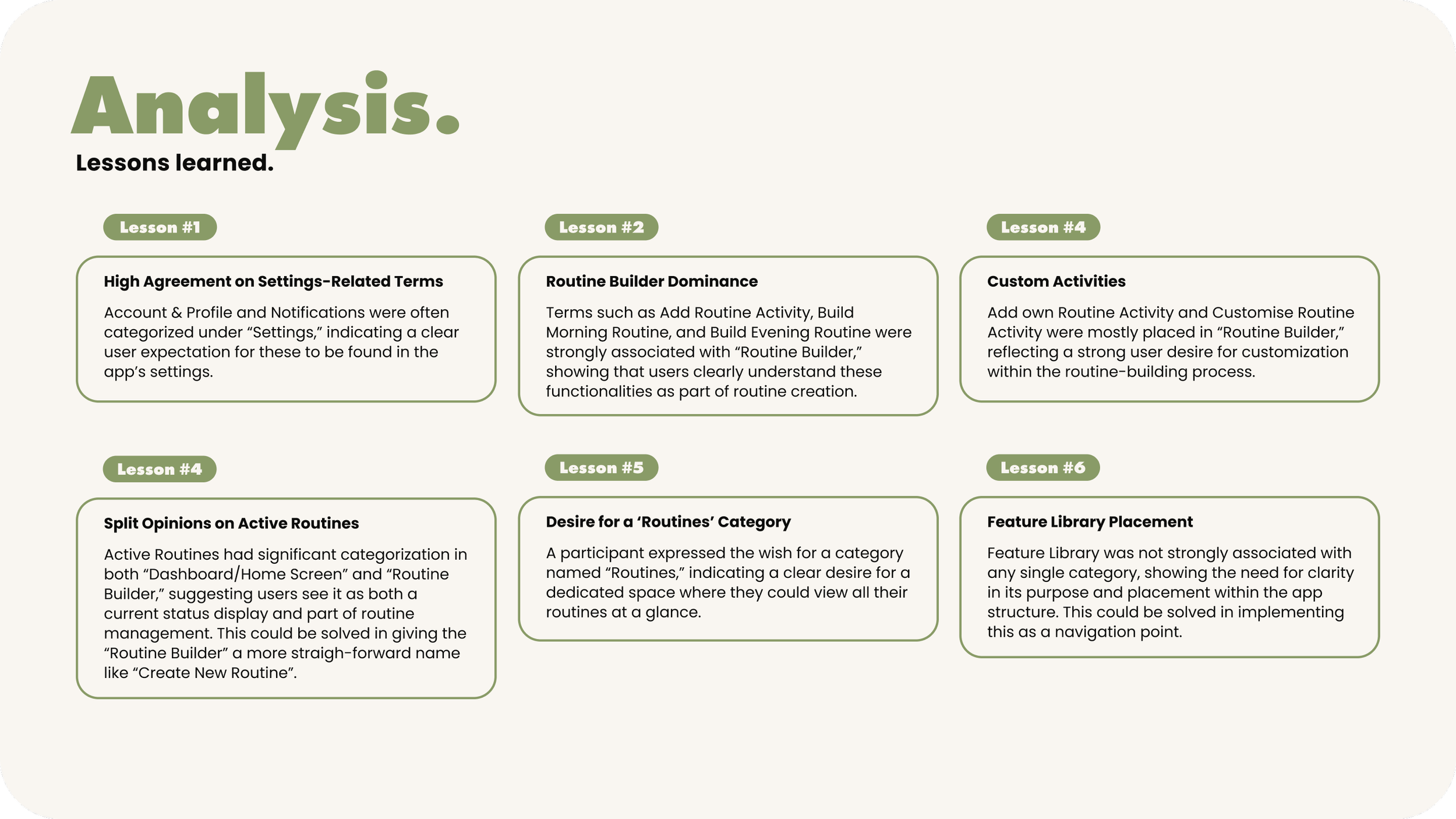
After developing the initial sitemap 1.0 based on the user flows, I conducted a card sorting session with 5 participants to refine the app’s structure. This exercise helped gather insights into how users naturally categorize and prioritize the app’s features. After analyzing the results, I used the findings to refine the structure and created the sitemap 2.0, ensuring a more intuitive and user-friendly navigation for Snoozle.
Sketching Snoozle.
To bring the initial concepts of Snoozle to life, I used my iPad to sketch out early design ideas. These sketches helped visualize key screens and features, allowing me to experiment with different layouts and interactions before moving on to more detailed wireframes.
Laying the foundation.
At this stage, I focused on creating a simple, low-fidelity prototype to map out the basic structure and user flows of Snoozle. These wireframes were kept minimal, prioritizing functionality and layout over visuals.
The goal was to test the overall navigation and ensure the app’s core features were well-placed before moving into more detailed design phases.
Building the structure.
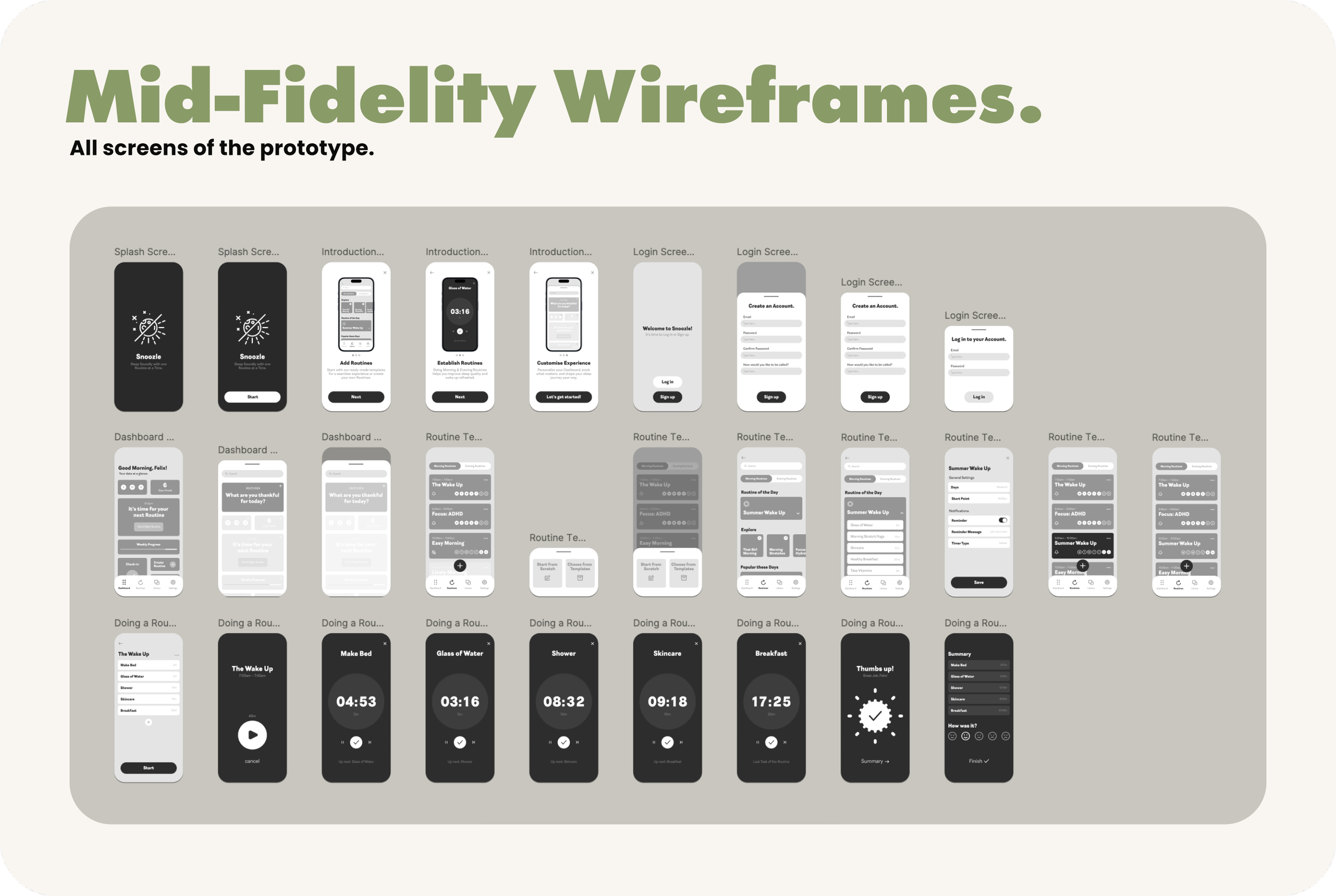
With the core layout established, I moved on to the mid-fidelity prototype, adding more detailed elements to the design.
After discussing with my mentor, we decided to simplify the onboarding process, which had initially become overwhelmingly large. We concluded that much of the information was already common knowledge for users and didn’t need to be explained in detail.
The mid-fidelity prototype provided a more complete picture of how Snoozle would operate, bridging the gap between the basic framework and the polished final design.
Polishing the details.
In this final stage, I brought Snoozle’s design to life with a high-fidelity prototype, adding the finishing touches to the visuals and interactions. Colors, typography, and other detailed UI elements were implemented to create a visually appealing and fully functional representation of the app.
This prototype was used to test both the aesthetics and usability, ensuring Snoozle was ready for development.
Test prep: Setting the stage.
Before conducting the usability tests for Snoozle, I focused on careful preparation to ensure meaningful feedback. This involved creating a detailed usability test plan, outlining the objectives, tasks, and scenarios to be tested.
I also developed a usability test script to guide participants through key features of the app, ensuring consistency across all sessions. These preparations set the foundation for a smooth and productive testing phase.
In action: Usability testing.
Building on the groundwork laid during the preparation phase, I conducted usability tests to observe how users interacted with Snoozle in real-world scenarios. These tests provided invaluable insights into the app’s usability, functionality, and overall user experience.
Guided by the detailed test plan and script, participants explored key features of the app while completing tasks and scenarios designed to reflect typical use cases. This phase allowed me to identify pain points, gather authentic user feedback, and pinpoint areas for improvement.
A vs. B: The Ultimate Face-Off.
To refine Snoozle’s design, I conducted preference testing to compare two UI options: fullscreen (Option A) and overlay (Option B).
Participants reviewed side-by-side screenshots and shared their preferences, offering valuable insights into the most engaging and user-friendly design choice.
Assess, Adapt, Achieve
After initial testing for Snoozle, I revisited user feedback to address critical gaps. Users struggled to connect routines with sleep due to a bright UI and overly customizable features that diluted the app’s focus.
The Next Evolution of Snoozle.
The new Snoozle prototype refines the app’s focus on better sleep, incorporating AI-tailored routines, a personalized quiz, and educational content. With a darker UI for a nighttime feel and improved usability, this iteration prioritizes clarity, engagement, and a sleep-first experience.
Looking back,
moving forward.
A Learning Experience
This project was a valuable opportunity to refine my UI design skills while balancing the unique challenges of creating a property investment app. From defining visual styles to building a responsive prototype, every step highlighted the importance of consistency and user-centered design. Establishing clear documentation with tokens, naming layers, and crafting reusable elements ensured the app was polished and cohesive.
Iteration and Growth
Throughout the process, I focused on achieving a balance between a professional investment platform and a light, intuitive user experience inspired by Airbnb. While this balance was challenging, it helped shape WonderWalls into an approachable yet credible solution. Though this project was UI-focused, I recognize the importance of usability testing for uncovering potential insights and refining the user experience further.
Future Potential
Moving forward, a round of usability testing could identify opportunities to improve accessibility and functionality. Additionally, expanding features like interactive property comparisons or advanced recommendations could enhance the app’s value. This project has laid a solid foundation for WonderWalls, but there’s room for iteration to make it even more user-focused and impactful.


