
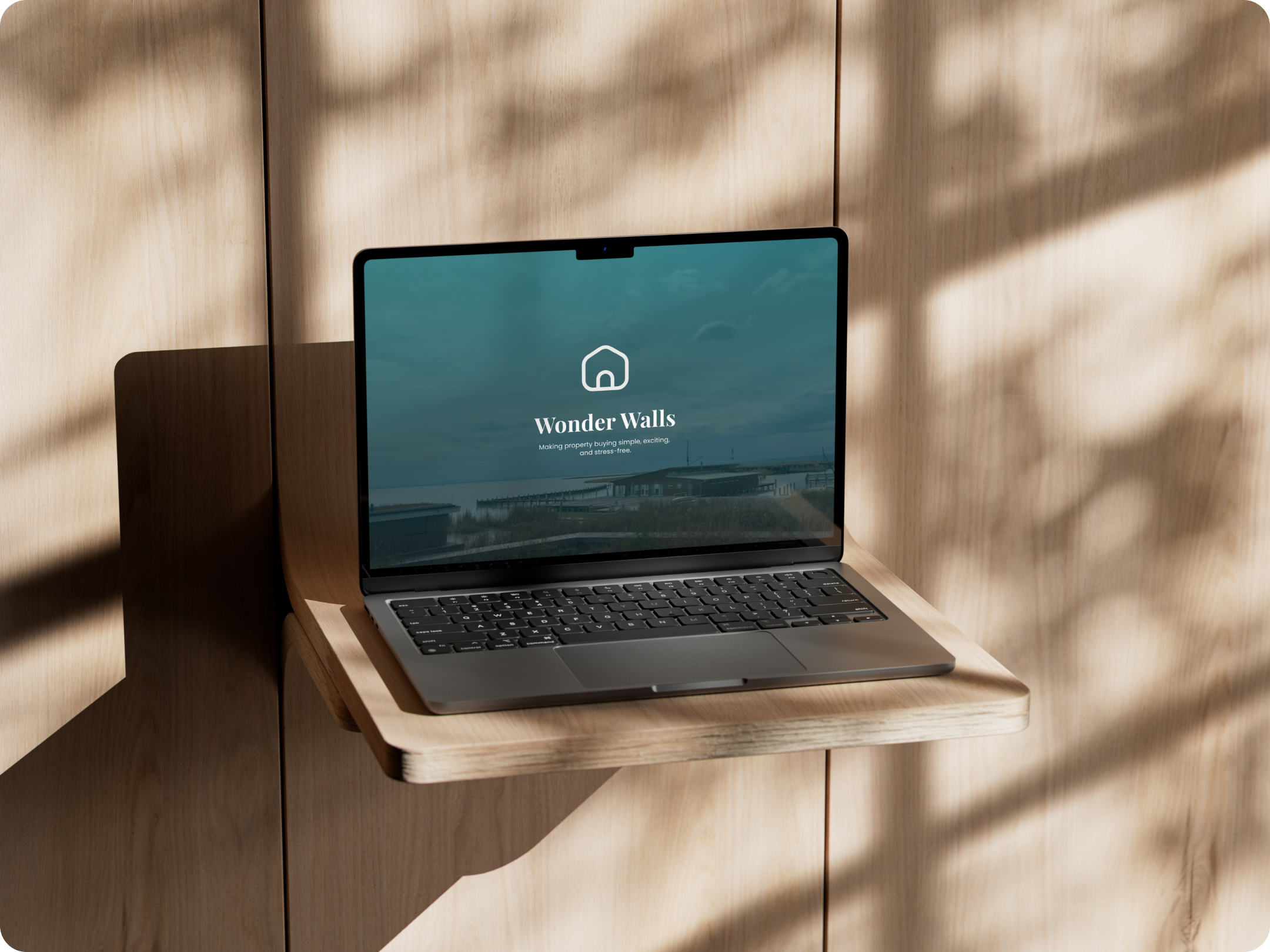
CF: Wonder Walls.
This project, undertaken as part of the CareerFoundry curriculum with a special focus on User Interface Design, centered on creating Wonder Walls, a responsive web app designed to help users explore and invest in properties effortlessly.
Wonder Walls streamlines the property-buying experience by offering tailored recommendations, detailed property information, and intuitive tools to save and compare listings. Whether users are new to real estate or experienced investors, Wonder Walls delivers a polished and approachable interface that makes finding the perfect property simple and enjoyable.
Client:
CF – CareerFoundry
(Student Project)
Company:
–
Year:
2025
Tools:
Figma
Procreate
ChatGPT
Briefing.
The WonderWalls app is part of a flexible project brief focused on creating a responsive web application for property exploration and investment.
Scope.
-
A responsive web app that provides property buyers with information on properties of interest.
-
An onboarding page, a screen or screens that introduce the user to the basics of exploring and using the app
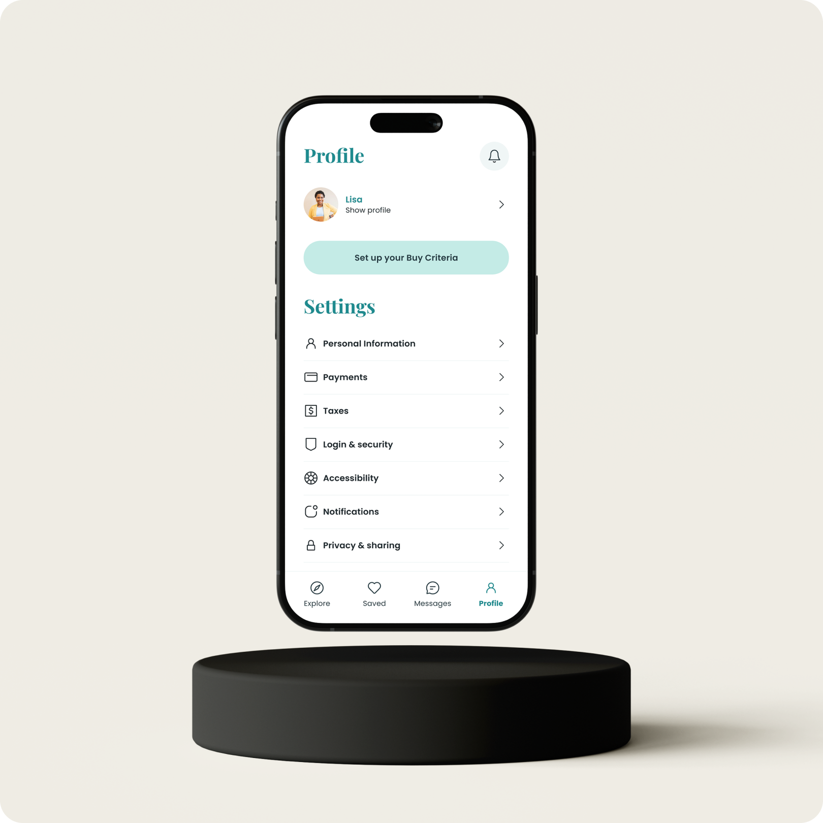
A way to sign up and log in, allowing users to input and save their property preferences and personal information
A home screen or dashboard where users can view recommended properties, saved favorites, and relevant updates
A menu that allows users to easily navigate the application
A feature that allows users to save and organize property listings (e.g., favorites, comparisons, bookmarked properties, etc.)
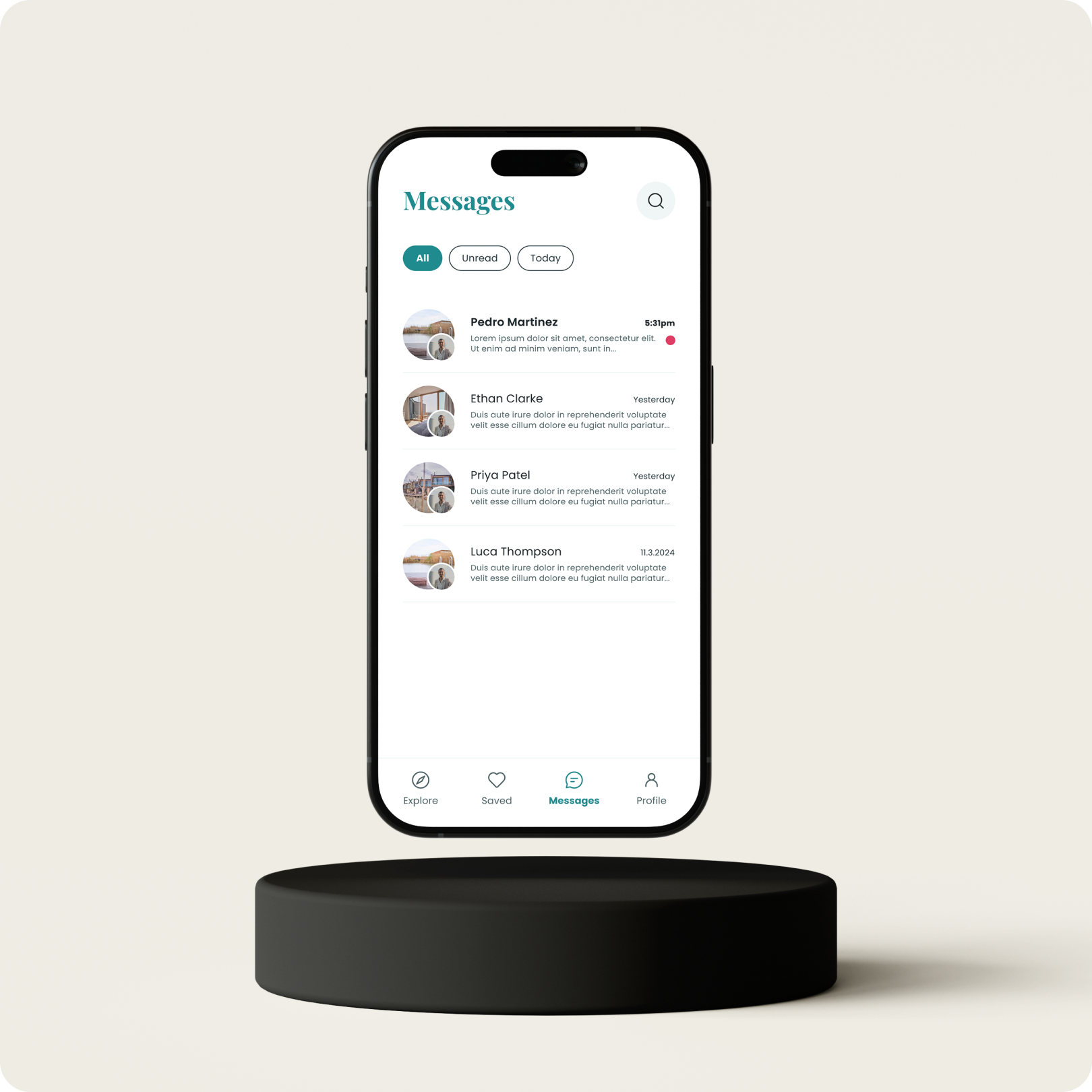
A messaging function that enables users to contact property agents or support directly within the app.
-
Achievement 1: Composition & Visual Design
User flow diagram
Paper wireframes (mobile)
Paper prototype (mobile)
Mid-fidelity wireframes (digital, mobile)
Mood board
High-fidelity mobile UI mockups
Achievement 2: Advanced UI & the Design Handoff
Final UI mobile mockups
Brand icon and icon set
Interactive prototype
Animated interaction
Style guide
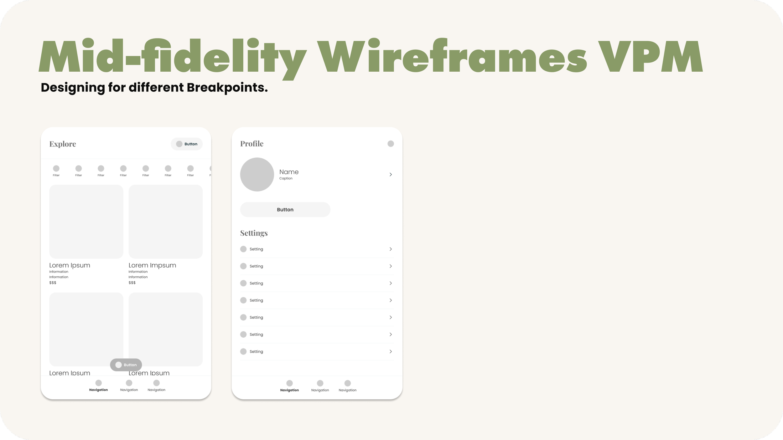
Mid-fidelity wireframes (tablet and desktop)
Final UI mockups for 2+ more breakpoints (tablet, desktop)
Presentation mockups for responsive design
Handoff package
-
Programming the app, final content and more advanced features.
-
1 month


Excerpts of the progress.
This section highlights key milestones from the Wonder Walls app design journey, showcasing the progression from initial research to prototype development.
Sketching Wonder Walls
To bring Wonder Walls to life, I used my iPad to sketch out early design ideas. These sketches helped visualize key screens and features, allowing me to experiment with different layouts and interactions before moving on to more detailed wireframes.

Building the structure
With the core layout established, I moved on to the mid-fidelity prototype, adding more detailed elements to the design.
The mid-fidelity prototype provided a more complete picture of how Wonder Walls will look like, bridging the gap between the basic framework and the polished final design.

Setting the mood.
In this section, I present the two moodboards I created to explore different visual directions for WonderWalls. Each moodboard reflects a unique aesthetic approach, balancing approachability with professionalism.
After careful consideration, I chose the sleeker and more professional moodboard, as it aligns best with the app’s goal of simplifying property exploration while maintaining a polished and trustworthy feel. This choice laid the foundation for a cohesive and visually refined design.

Small clicks, big wows!
This section highlights a playful animation I created for the “Save Property” interaction in Wonder Walls.
When users save a property, they’re greeted with a smooth and delightful animation that not only confirms their action but also adds a touch of personality to the experience. This microinteraction is designed to make even small moments engaging, reinforcing the app’s approachable and user-friendly design.
Crafting Consistency
The Wonder Walls Style Guide is the cornerstone of a consistent and polished design system. It covers all the essential elements that shape the app’s visual identity and user experience, including typography, imagery, colors, logo usage, spacing, icons, grids & viewports, input text fields, buttons, and cards.
To ensure efficiency and flexibility, I utilized design tokens for key styles like colors, typography, and spacing. Additionally, I set clear guidelines for the usage of each element, ensuring a cohesive and user-friendly design across all screens.

Breaking the point.
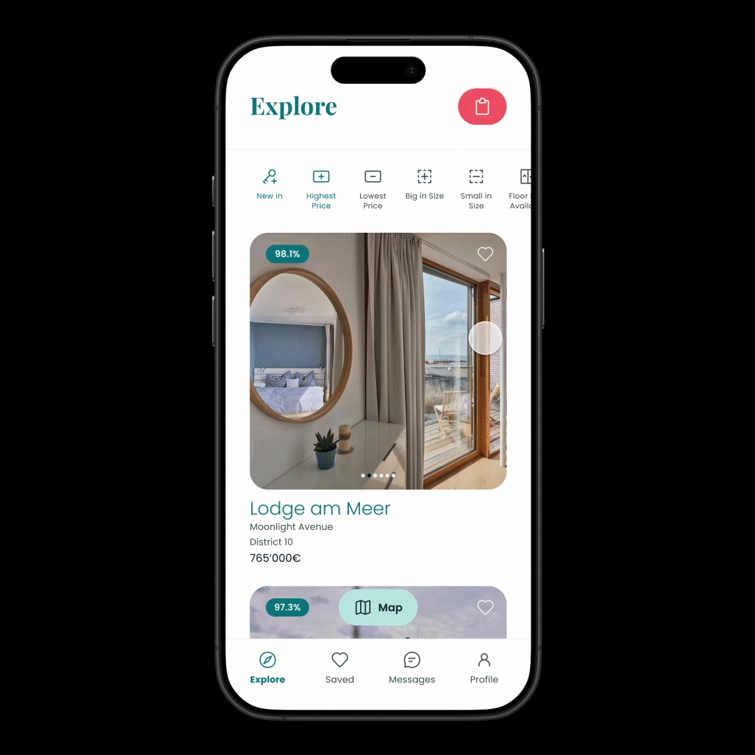
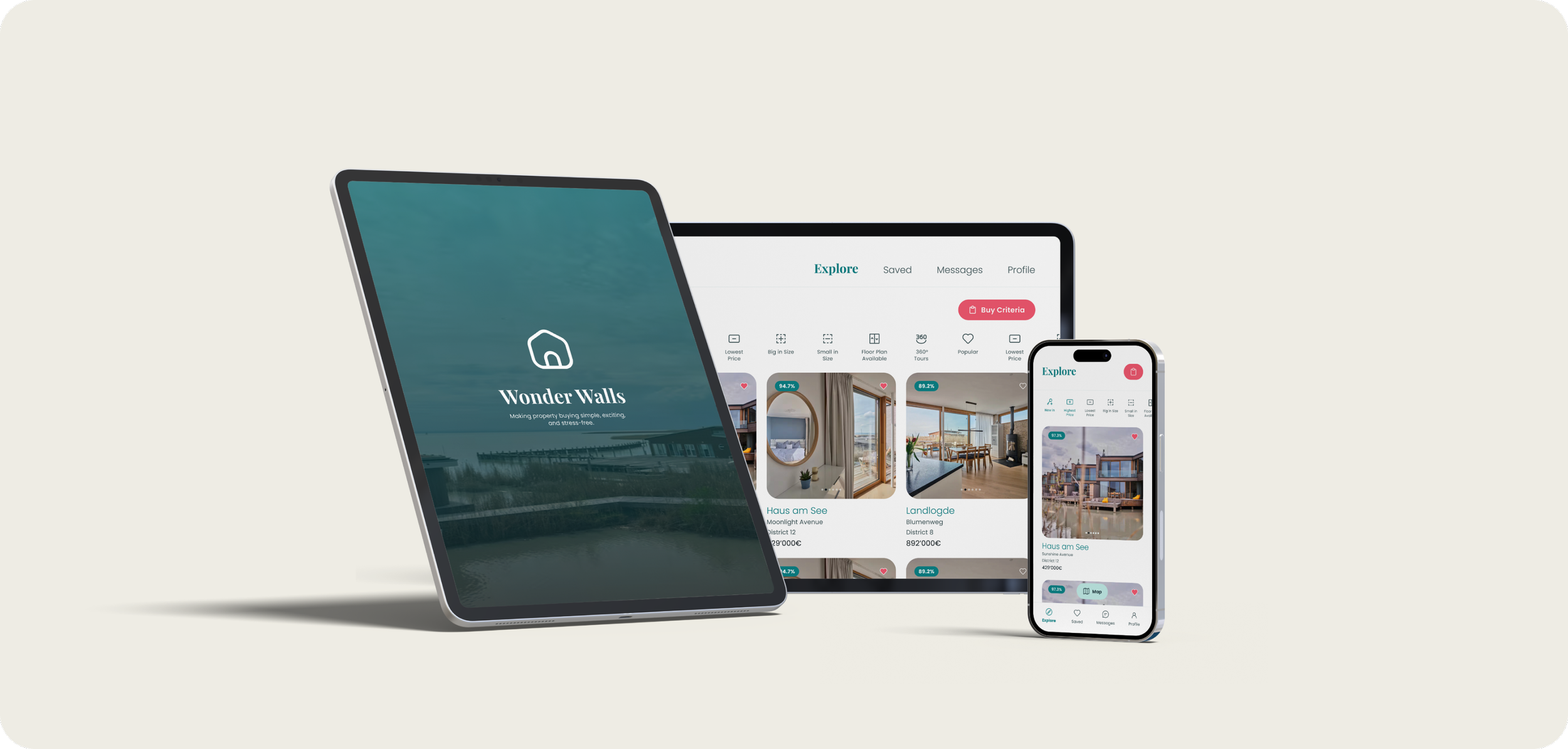
In designing the WonderWalls app, I took a mobile-first approach to ensure the core user experience was optimized for smaller screens, where simplicity and clarity are most critical. Starting with sketches, I focused on defining the structure and flow, keeping mobile users’ needs at the forefront. Once the mobile design was solidified, I created high-fidelity wireframes, adapting the layout seamlessly for viewports medium (VPM) and viewports large (VPL).


Bringing it all together:
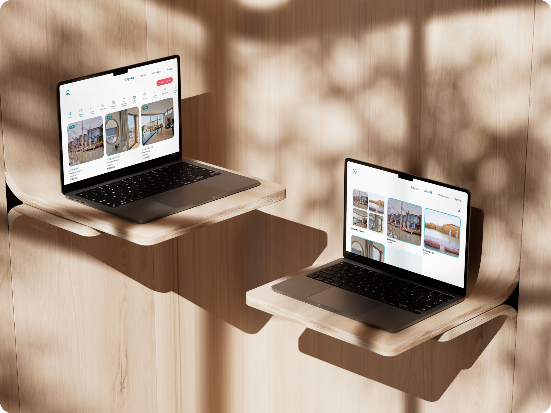
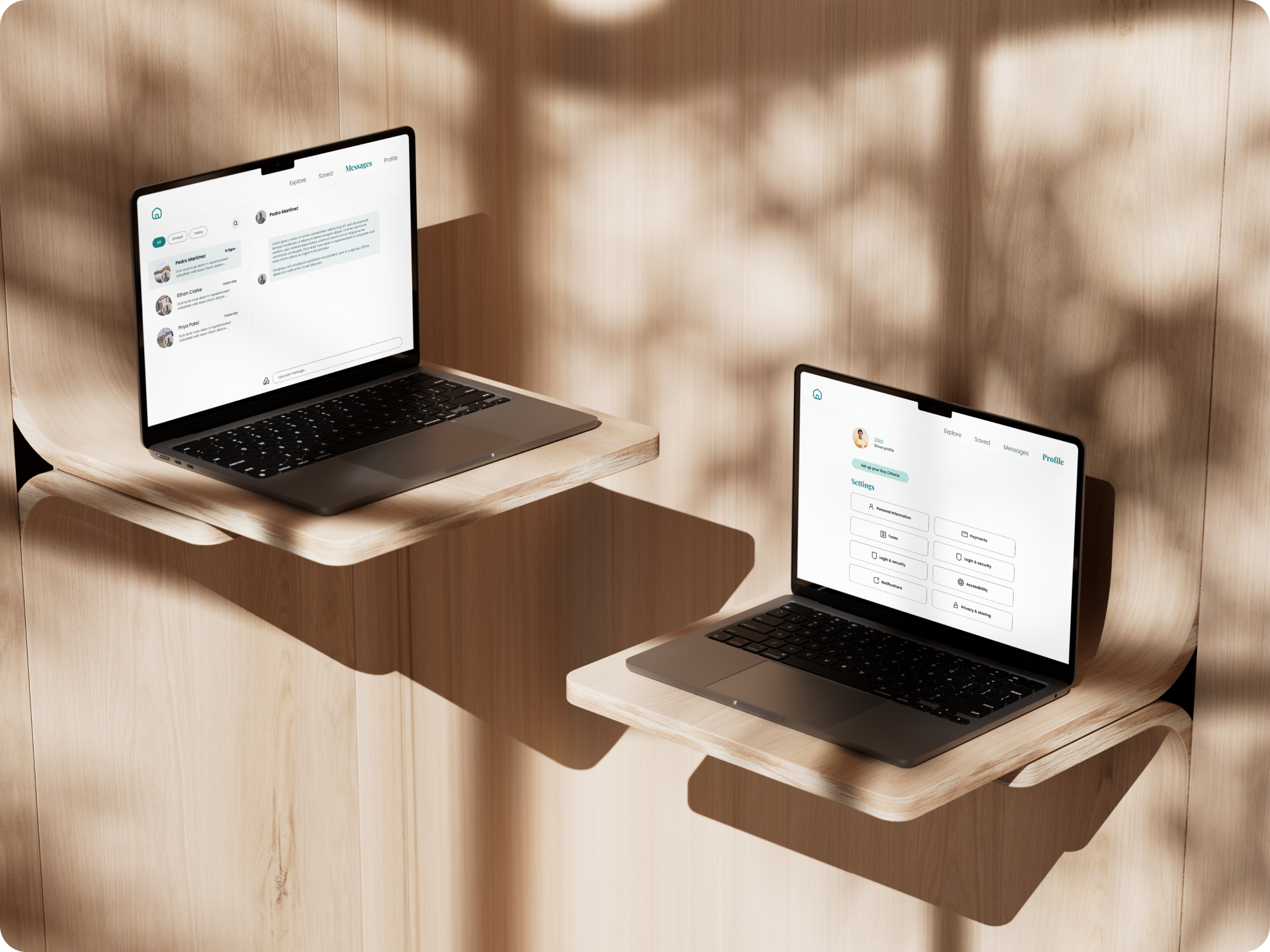
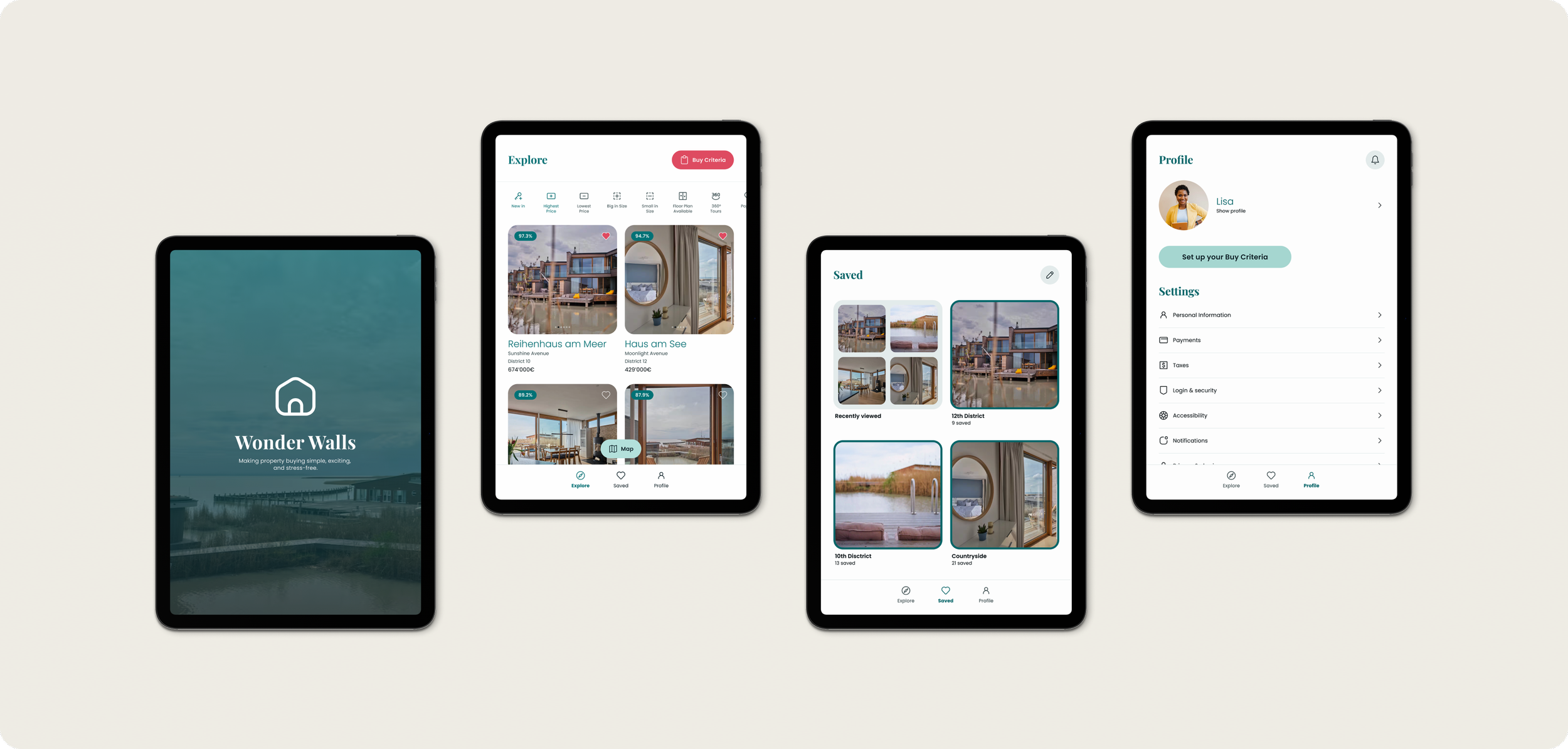
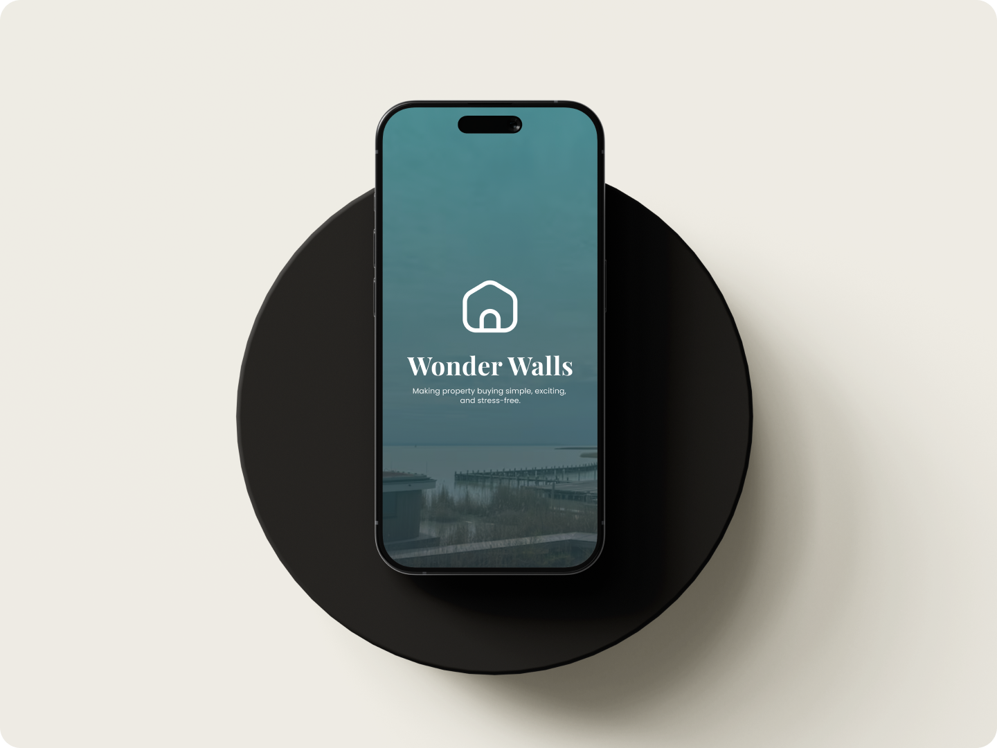
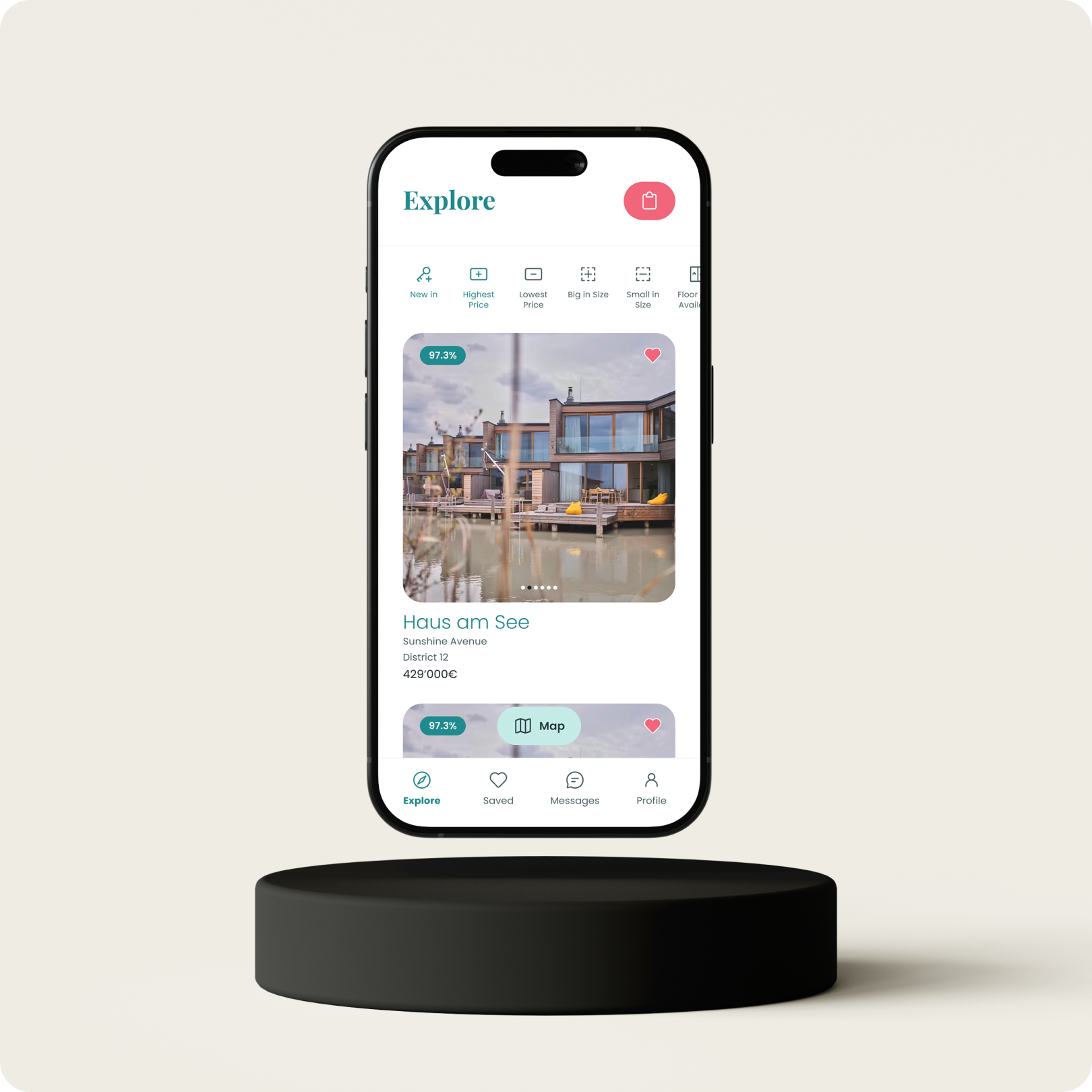
In this section, I present the fully designed Wonder Walls app across three viewports: mobile, tablet, and desktop. This responsive showcase highlights how the app adapts seamlessly to different screen sizes, ensuring a consistent and user-friendly experience. From intuitive navigation on mobile to detailed layouts on larger screens, Wonder Walls is designed to deliver functionality and elegance on any device.

Looking back,
moving forward.
The WonderWalls project gave me the chance to design a responsive web app that balances the seriousness of property investment with an approachable, user-friendly interface.
Challenges and Solutions
My biggest challenge was finding the right balance between creating a professional investment platform and delivering a light, intuitive experience inspired by Airbnb. The inspiration from Airbnb stemmed from its ability to take a traditionally formal and complex process—booking accommodations—and transform it into an approachable, human-centered experience. I wanted WonderWalls to emulate that balance by ensuring that users felt confident in their investment decisions without being overwhelmed by jargon or an overly corporate aesthetic. To achieve this, I focused on clear typography, inviting colors, and visual cues that guided users naturally through the platform, all while maintaining a sense of professionalism.
Successes and Highlights
I’m particularly proud of how the visual design supports the app’s functionality. By incorporating design patterns inspired by platforms like Airbnb, I was able to create a seamless and polished user experience. This attention to detail made the platform not only aesthetically pleasing but also approachable and easy to navigate.
Lessons and Future Improvements
Looking back, I realize the immense value usability testing could have brought to this project. While the focus was primarily on UI design, usability testing would provide insights into how real users interact with the platform. Testing could help identify areas where the design might unintentionally cause friction or fail to meet user expectations.
If I were to continue working on WonderWalls, I’d conduct usability testing during two critical phases:
After the initial wireframes or prototypes are created. This would help validate that the structure and navigation are intuitive before investing in high-fidelity design.
Following the development of a clickable prototype. This would allow me to assess how the final design elements—such as color, typography, and micro-interactions—support usability and accessibility.
By gathering user feedback at these stages, I could refine the platform further, ensuring it delivers both functional excellence and an outstanding user experience.